
CSS animations and transitions transform static websites into dynamic, interactive experiences — completely without JavaScript. They enable flowing, visually appealing effects that make interactions more vivid and bring designs to life.
In this guide, we go beyond the basics and show advanced techniques, explain the most important concepts and give practical examples that you can use to integrate complex animations into your web project.
Transitions make it possible to gently and controllably animate the transition from one style state to the next. Instead of abrupt changes, style changes are presented fluently over a fixed period of time — this ensures more natural interactions and a better user experience.
Basic syntax:
.element {
  transition: property duration timing-function delay;
}
example:
.button {
  background-color: #3498db;
  transition: background-color 0.5s ease-in-out;
}

.button:hover {
  background-color: #2980b9;
}
Explanation:
During hover, the background color of the button is gently changed from light to dark blue over 0.5 seconds. The ease-in-out function provides a soft start and end point.
You can animate multiple CSS properties at the same time by separating them with commas. In this way, complex, coordinated effects can be created in a single transition.
example:
.card {
  background-color: #fff;
  transform: translateY(0);
  box-shadow: none;
  transition: background-color 0.4s ease, transform 0.4s ease, box-shadow 0.4s ease;
}

.card:hover {
  background-color: #f7f7f7;
  transform: translateY(-5px);
  box-shadow: 0 8px 16px rgba(0, 0, 0, 0.2);
}
Explanation:
With the hover, the background color, position, and shadow change simultaneously over 0.4 seconds — a harmonious effect that creates depth and interactivity.
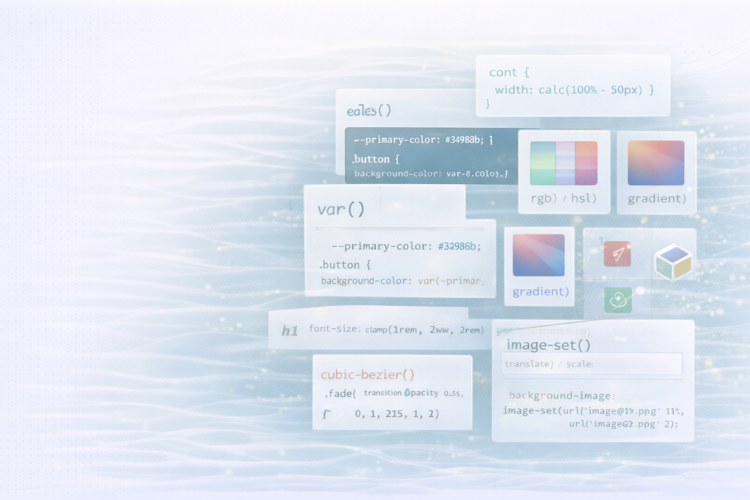
In addition to standard functions such as ease, linear or ease-in-out, you can cubic-bezier () define individual acceleration curves. This gives you full control over the animation process.
example:
.panel {
  transition: height 0.6s cubic-bezier(0.68, -0.55, 0.27, 1.55);
}
Explanation:
This feature creates an “overshoot” effect — the element moves just past the target position before leveling off. Perfect for vivid, playful animations.
With CSS animations, you can move through so-called keyframes steer. This makes it possible to create multi-level, repeatable or endless animations — far beyond simple hover effects.
Basic syntax:
@keyframes fadeIn {
  from { opacity: 0; }
  to { opacity: 1; }
}
Apply the animation to an element:
.element {
  animation: fadeIn 1s ease-in forwards;
}
parameters:
Explanation:
An element with the class .fade-in Fades in gently over a second — from 0 to full opacity.
Keyframes aren't limited to start and end. Through intermediate steps, you can create complex movements.
example:
@keyframes slideAndFade {
  0% {
    opacity: 0;
    transform: translateX(-100%);
  }
  50% {
    opacity: 0.5;
    transform: translateX(0);
  }
  100% {
    opacity: 1;
    transform: translateX(0);
  }
}

.slide-fade {
  animation: slideAndFade 1.2s ease-out forwards;
}
Explanation:
The element slides in from the left as it slowly fades in — an elegant effect that draws attention.
You can apply multiple animations to an element at the same time or with a time delay to create more depth and movement.
example:
@keyframes rotate {
  from { transform: rotate(0deg); }
  to { transform: rotate(360deg); }
}

@keyframes scale {
  from { transform: scale(1); }
  to { transform: scale(1.2); }
}

.combined {
  animation: rotate 2s linear infinite, scale 2s ease-in-out infinite alternate;
}
Explanation:
The element rotates continuously and pulsates in size at the same time — a modern effect that is particularly impressive with icons and logos.
For smooth movement, particularly on mobile devices, GPU acceleration is critical. With CSS transforms such as TranslateZ (0) The browser can hand over rendering processes to the graphics card.
example:
.optimized {
  transform: translateZ(0); /* Triggers GPU acceleration */
  transition: transform 0.3s ease;
}

.optimized:hover {
  transform: translateZ(0) scale(1.05);
}
Explanation:
By adding TranslateZ (0) hardware acceleration is enabled. The result is smoother animations and better performance — especially on less powerful devices.
Will-change targeted:.animated {
will-change: transform, opacity;
}
CSS transitions and animations are powerful tools for making web design lively, responsive, and emotionally appealing. Through targeted use of easing functions, keyframes, and performance optimizations, you can significantly upgrade your website — without a single line of JavaScript.
Use movement specifically to guide users, emphasize interactions and make your brand visually tangible.
UNHYDE is a web development agency from Munich, specialized in high-performance websites, UX design and digital brand strategies. We build scalable solutions on platforms such as Shopify and Webflow that enable measurable growth.
Whether you want to technically optimize your web project or visually upgrade it — We help you create digital experiences that inspire.
CONTACT US
Get in touch
contact now