
Responsive design is a central part of modern web development. It ensures that websites are displayed optimally and run smoothly on all devices — from smartphones to tablets to desktop computers.
The key to this approach is Media Queries, a CSS technique that allows layouts to be dynamically adjusted to screen width, resolution, or orientation. In this article, you'll learn how responsive design works, what role media queries play and how to use them effectively in your development practice.
Responsive design means designing websites in such a way that they automatically adapt to the respective device. Instead of developing multiple versions of a website, the result is a single, flexible layout that dynamically adapts to screen size and resolution.
The result: better usability, easier maintenance, and improved SEO performance.
max-width: 100% dynamically adapts to the layout.
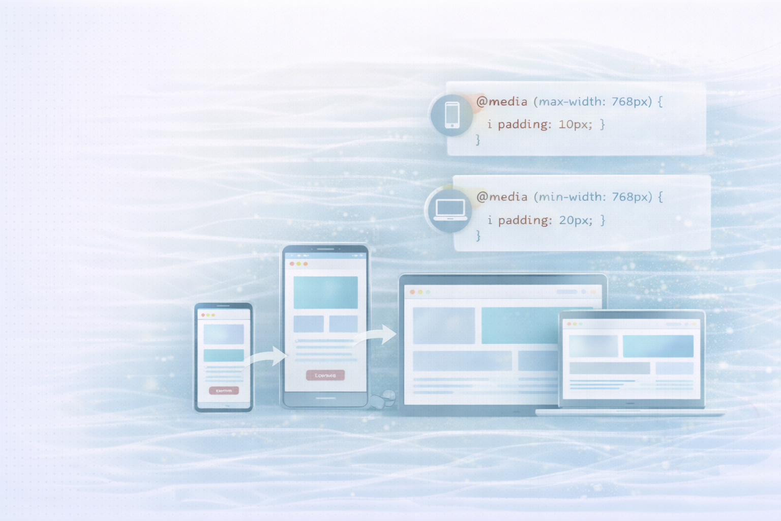
Media queries are CSS rules that apply specific styles only when specified conditions — such as screen width, height, orientation, or resolution — are met. This allows you to optimize layouts specifically for different devices.
Basic syntax:
@media (condition) {
  /* CSS rules here apply when the condition is true */
}
example:
@media (max-width: 768px) {
  .container {
    padding: 10px;
  }
}
Explanation:
This rule reduces the internal spacing of .containerclass as soon as the screen width is 768 pixels or less. This keeps the layout clear and easy to use on smaller devices.
A Mobile-first approach means optimizing the design for small screens first and then gradually expanding it for larger displays. This approach ensures that essential functions and content remain accessible even under limited conditions, such as low bandwidth.
example:
/* Base styles for mobile devices */
body {
  font-size: 16px;
  padding: 10px;
}

.header {
  text-align: center;
}

/* Enhancements for larger screens */
@media (min-width: 768px) {
  body {
    font-size: 18px;
    padding: 20px;
  }

  .header {
    text-align: left;
  }
}
Explanation:
The basic styles are aimed at mobile users. From a width of 768 pixels, the font size and layout are adjusted — ideal for tablets or laptops.
Media queries are extremely versatile and offer far more options than just adapting to screen widths.
Sometimes screen orientation has a strong influence on the layout — for example in galleries or product listings. With Orientation Can you react specifically to portrait or landscape mode.
@media (orientation: landscape) {
  .gallery {
    grid-template-columns: repeat(3, 1fr);
  }
}
Explanation:
In landscape mode, three columns are displayed, while in portrait mode, only one or two may be visible.
On modern devices with high pixel density, graphics often look blurry without adjustment. With special media queries, you can load optimized graphics for this purpose.
@media (-webkit-min-device-pixel-ratio: 2), (min-resolution: 192dpi) {
  .logo {
    background-image: url('logo@2x.png');
  }
}
Explanation:
This rule automatically loads a higher resolution version of the logo on devices with Retina or HD displays.
You can combine multiple conditions to cover very specific scenarios — such as specific device sizes in a specific orientation.
@media (min-width: 768px) and (max-width: 1024px) and (orientation: portrait) {
  .sidebar {
    display: none;
  }
}
Explanation:
Here, the sidebar is only hidden in portrait mode on tablets — ideal for saving space and improving the user experience.
Responsive design is not a “nice-to-have” today, but a standard. With media queries, you can flexibly design layouts, prioritize content, and ensure that your website performs optimally on every device.
A mobile-first approach combined with well-thought-out media queries not only improves the user experience, but also the performance and visibility of your website.
UNHYDE is a Munich-based web development agency based on high-performance websites, UX optimization and digital brand development specialized. As Shopify Partner Agency We help companies around the world develop sophisticated, scalable web solutions — from concept to conversion.
Whether you want to responsively optimize your website, improve the user experience, or scale your online presence internationally — We help you create compelling digital experiences.
Get in touch
contact now