
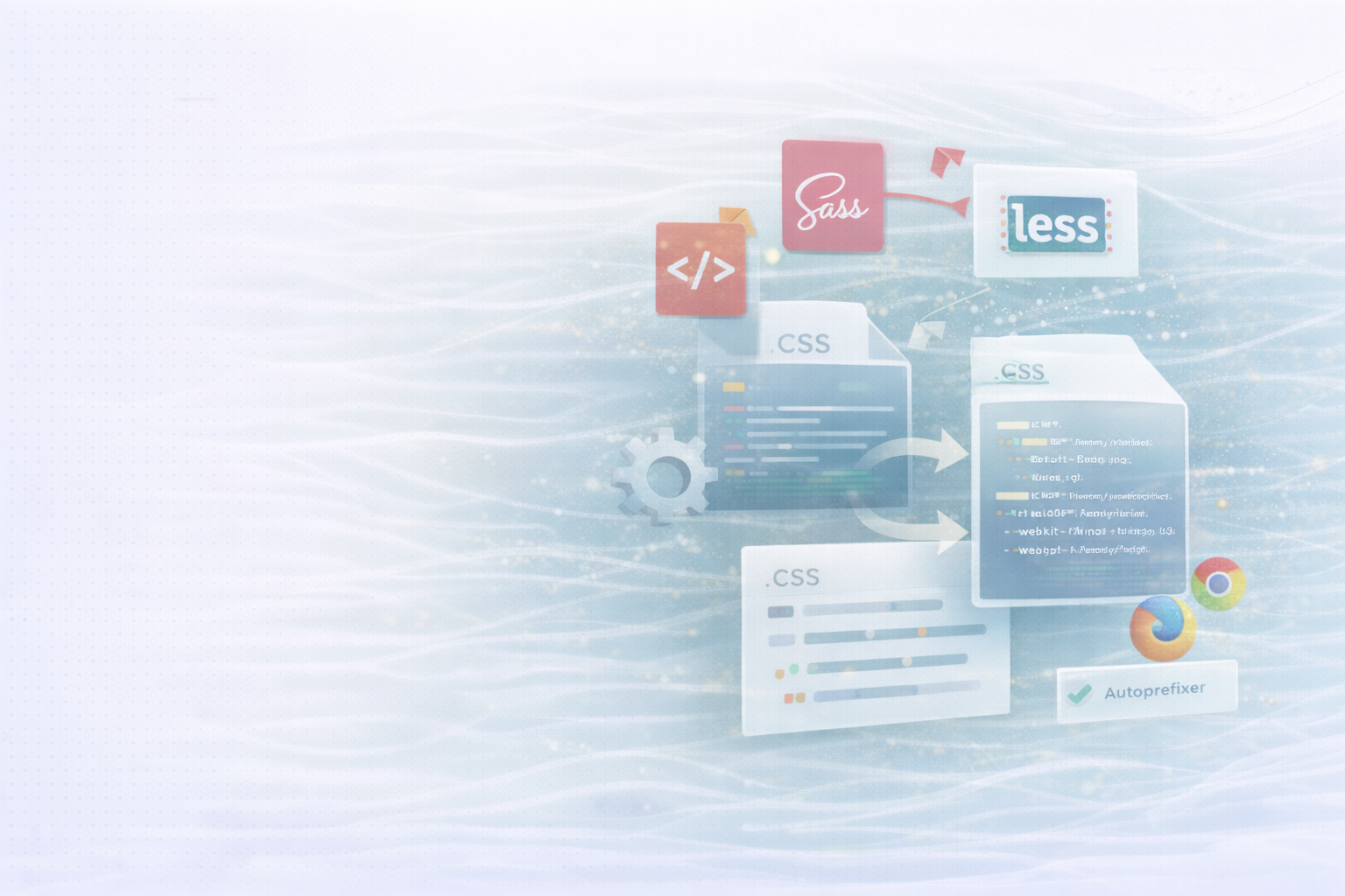
Calc () Unto image set () for responsive, dynamic interfaces
CSS is much more than just a “styling format.” With features such as Calc ()Variables about var (), responsive with sizes clamp () As well as color, gradient and transform functions, you build dynamic, high-performance and scalable layouts — without JavaScript. This guide gives you a practical overview: from arithmetic calculations and variable management to color manipulation, responsive typography, and high-resolution assets.
Calc () — Calculate directly in CSSWhat it can do: Mathematical operations in declarations, including mixing units (%, px, rem). Perfect for flexible layouts, such as when fixed and fluid values are combined.
Exemple:
.container {
 width: calc(100% - 50px);
}
Result: The width adapts to the parent container and constantly subtract 50 px — ideal for sidebars, gutters or fixed UI elements.
var () — Design systems with custom CSS propertiesWhat it can do: Define reusable variables centrally and use them anywhere. Facilitates theming, spacing, color and typo definitions.
Exemple:
:root {
 --main-color: #3498db;
 --padding: 20px;
}

.button {
 background-color: var(--main-color);
 padding: var(--padding);
}
Tip: For fallbacks, you can var (--token, fallback) Use.
min (), max (), clamp () — Responsive sizes with limitsWhat they can do: Limit values depending on viewport conditions or dynamically scale between min/max limits.
Example with clamp ():
h1 {
 font-size: clamp(1rem, 2vw, 2rem);
}
Result: The font size scales smoothly across 2vw, but never falls below 1rem And exceeds 2rem Not. Perfect for fluid typography.
rgb (), rgba (), hsl (), hsla ()What they can do: Define colors via RGB or HSL, optionally with alpha transparency. HSL is often more intuitive for tone/saturation/brightness, especially with design systems.
Exemple:
.button {
 background-color: rgba(52, 152, 219, 0.8);
}
Tip: For consistent pallets, it's worth using HSL (hsl (210 60% 50% /0.8)) — modern syntax without commas is widely supported.
(), radiogral (), conic gradient ()What they can do: Vector-based color gradients without image files — high-performance, scalable, flexible.
Example (linear):
.hero {
 background: linear-gradient(45deg, red, blue);
}
Applications: Linear Gradients for Backgrounds, Radial for Glows/Focus, Conical for Charts or “Sweep” Effects.
translate (), rotate (), scale (), skew ()What they can do: 2D/3D manipulations for movement, rotation, scaling — essential for micro-interactions and high-performance animations (GPU-friendly).
Exemple:
.box {
 transform: translate(50px, 100px) rotate(30deg);
}
Tip: Put on for smooth animations Transform and opacity Instead of layout-related properties such as top/left or Width/height.
cubic-bezier ()What it can do: Precise control of acceleration/deceleration for transitions/animations via individual easing curves.
Exemple:
.fade {
 transition: opacity 0.5s cubic-bezier(0.25, 0.1, 0.25, 1);
}
Tip: Use tools such as Cubic Bezier Editors to create natural-looking movements (overshoot, ease-out).
attr () — Attributes in content utilizeWhat it can do: Attribute values in content Output pseudo-elementary (still limited outside of content).
Exemple:
a::after {
 content: " (" attr(href) ")";
}
Use cases: print versions, accessibility notes, inline metadata — note current support restrictions.
env () — Safe areas and device specificsWhat it can do: Respect user agent environment variables (such as notch-safe areas) so that content is not obscured.
Exemple:
.header {
 padding-top: env(safe-area-inset-top);
 padding-right: env(safe-area-inset-right);
}
Tip: Particularly relevant for iOS devices with notches and rounded corners.
image set () — Sharp images for high-DPIWhat it can do: Provide multiple resolutions; the browser selects according to the pixel density.
Exemple:
.hero {
 background-image: image-set(
    url('image@1x.png') 1x,
    url('image@2x.png') 2x
    );
 }
Note: For <img> forth srcset/sizes use; image set () Is ideal for Background image.
• Set Will-change For example, for hover intros or repetitive animations, to optimize the rendering pipeline — but sparingly so that the browser does not unnecessarily reserve resources.
Exemple:
.card:hover {
  will-change: transform;
}
• Use :root As a Central Design Token Source (Colors, Spacing, Radii) and Combine var () With clamp () for resilient, responsive scales.
:root {
  --space-1: 0.5rem;
  --space-2: 1rem;
  --radius: 0.5rem;
}

h2 {
  font-size: clamp(1.125rem, 2vw, 1.5rem);
}
• For animation performance: Transform + opacity Prefer, minimize repaints, dose duration/intensity in favor of UX, Prefers-reduced-motion Respect.
@media (prefers-reduced-motion: reduce) {
  * {
    animation: none !important;
    transition: none !important;
  }
}
• Keep colors consistent: With HSL, tones can be systematically varied (same hue, different lightness/saturation) — ideal for states (hover/active/disabled).
CSS functions are the foundation of modern, responsive UI development: They combine flexibility with performance, replace many JS workarounds and make design systems consistently scalable. With Calc (), var (), clamp (), color and transform functions, image set () And so on, you build layouts that adapt intelligently, look razor-sharp and feel natural.
UNHYDE is a web development agency from Munich, specialized in High-performance web design, UX strategies and digital brand development. As Shopify Partner Agency We implement high-performance, tailor-made web solutions for international brands.
Our goal: functional design, strong performance and sustainable growth through sophisticated web development.
Get in touch
contact now