introduction

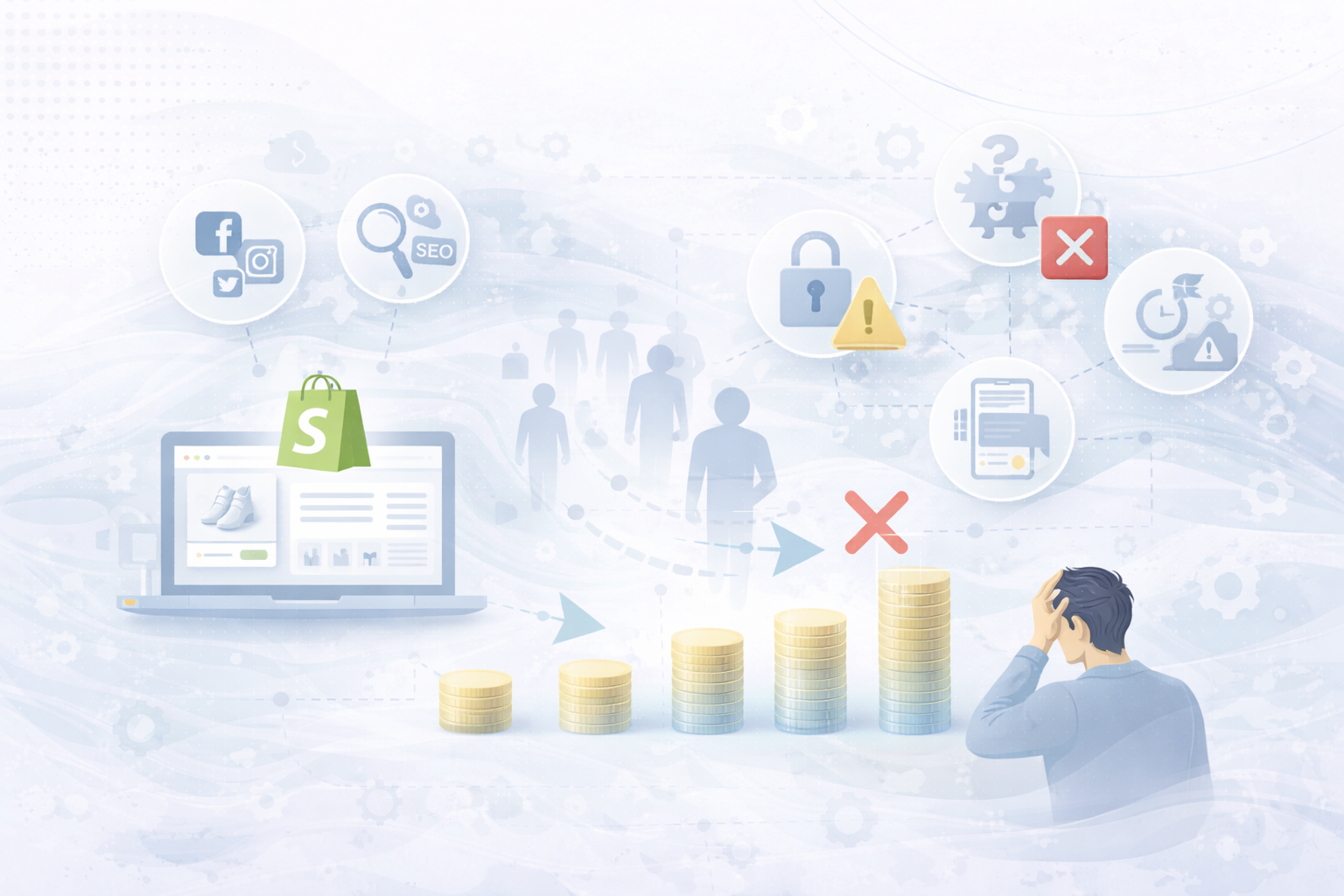
Why do users cancel buying processes even though the product, price and marketing are right?

In many cases, it is not the offer — but the overburden.
Too much information, too many options, too many decisions.

This phenomenon is called Cognitive Load: the mental load that a user experiences when navigating and making decisions.

In this article, we'll show you:

  • What cognitive load really means in e-commerce
  • Why it massively influences conversion rates
  • And how you him Specifically reduce in your Shopify shopto generate more revenue from existing traffic.

What is cognitive load — simply explained

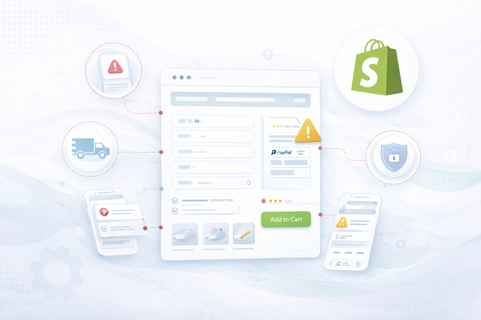
Cognitive load describes the Amount of mental energy, which a person must muster in order to process information and make decisions.

In the Shopify shop, this means:

  • read
  • compare
  • understand
  • rate
  • decide

👉 The higher the mental load, the more likely it is Cancelling instead of buying.

Why cognitive load is one of the biggest conversion killers

People want Don't thinkWhen they buy — they want to feel safe.

Typical consequences of high cognitive load:

  • longer decision time
  • uncertainty
  • Defer
  • Purchase cancellation

Mobile users in particular react extremely sensitively to excessive demands.

Typical causes of high cognitive load in Shopify stores

  • Too many product variants
  • Long, unstructured texts
  • Multiple competing CTAs
  • Complex navigation
  • Unclear priorities on pages
  • Too many visual stimuli
  • Lack of guided tour through the shop

👉 Don't sell “more information” — better leadership sold.

9 levers to reduce cognitive load in the Shopify shop

1. Clear visual hierarchy

The user must immediately recognize:

  • What is important?
  • What is the next step?

Best practices:

  • One clear main action per page
  • Use size & color contrasts in a targeted manner
  • Using white space consciously

2. One decision at a time

People make better decisions when they waged become.

Instead of:
10 options at the same time

Better:

  • Pre-selected variants
  • Recommendations (“Most popular”)
  • Step-by-step selection

3. Simplify product variants

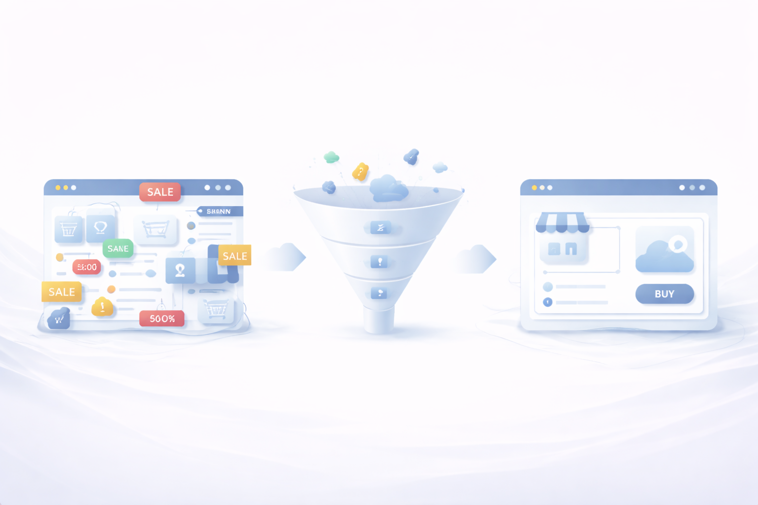
Too many variants = decision paralysis.

Shopify lever:

  • Visually represent variants
  • Highlight most popular option
  • Hide options that are not relevant

4. Make texts scannable

Users don't read — they scan.

Better than continuous text:

  • Bullet Points
  • subheadings
  • Icons & highlights

👉 Read less = less mental load.

5. Communicate benefits before details

Details are important — but only after use.

structure:

  1. benefit
  2. upshot
  3. details

This makes the user feel safe more quickly.

6. Consistently remove distractions

Each additional option is a mental burden.

Typical distractions:

  • Multiple CTAs
  • Too many trust badges
  • Pop-ups at the wrong time

👉 Focus beats diversity.

7. Simplify navigation

The more menu items, the higher the cognitive load.

Best practices:

  • Maximum 5-7 main points
  • Clear naming
  • No internal technical terms

8. Think mobile first

Mobile users have:

  • less space
  • less patience
  • more distraction

Important:

  • big buttons
  • Short texts
  • Sticky add-to-cart
  • Clear scrolling

9. Consistency across the store

Different designs, terms or processes increase mental stress.

Consistency means:

  • Same CTA names
  • Consistent layouts
  • Predictable processes

👉 Predictability creates security.

📊 Recommended graphics for the blog post

Ideal position in the text:
After the headline
👉 “How cognitive load influences buying decisions”

Napkin-AI-Prompt (German)

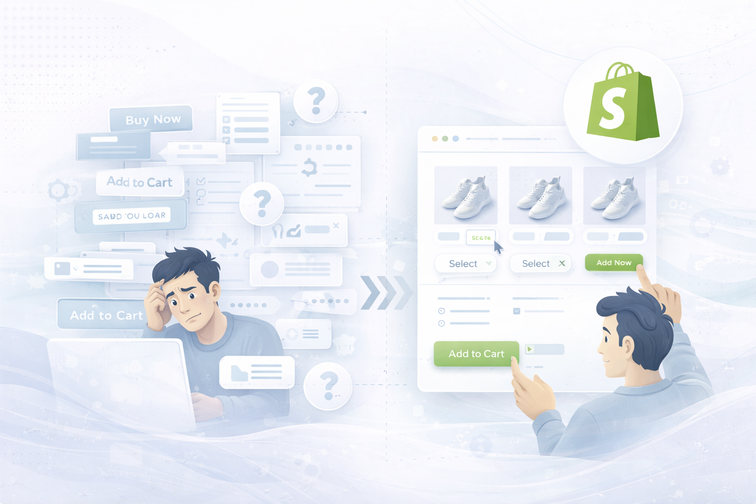
Create a modern, clear diagram about cognitive load in e-commerce.

Presentation:
A user who is overwhelmed by many options, texts and decisions
compared to a reduced, clearly managed Shopify shop structure.

elements:
Options, CTAs, texts, product variants, decision-making processes.

style:
Minimalistic, professional, black and white with a subtle accent color.
Clear comparison: high vs. low cognitive load.

Objective:
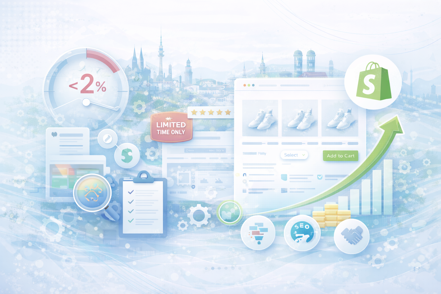
Visualize why less complexity leads to higher conversion rates


Common mistakes when reducing cognitive load

  • Explain too much at once
  • Show everything equally important
  • Confuse reduction with loss of information
  • Ignore mobile UX

Less complexity means not less information — but better prioritization.

conclusion

Successful Shopify stores don't force users to think—they lead them to a decision.
Anyone who specifically reduces cognitive load increases conversion rates measurably, without aggressive selling or discount battles.

🚀 Psychologically optimize Shopify conversion

Would you like to know where your Shopify shop is creating unnecessary mental hurdles?

👉 Here you can find our Shopify services

We optimize Shopify stores psychologically based, user-centered and data-based.

Conversion optimization for Shopify: 12 levers that instantly increase your sales
What belongs on a good homepage — and what doesn't
How much does a Shopify agency really cost? Realistic prices, budgets, and backgrounds
Why your Shopify store has traffic — but not selling
Optimize e-commerce conversion rate: Why 90% of shops start in the wrong places
Shopify conversion rate below 2%? Causes, benchmarks and concrete solutions for more sales
Optimizing Shopify Checkout: The 12 Most Common Conversion Killers (and How to Get Rid of Them)
UNHYDE•UNHYDE•UNHYDE•UNHYDE•UNHYDE•UNHYDE•